BRAND CRUSH: SIX REASONS TO USE BENJAMIN MOORE PAINT
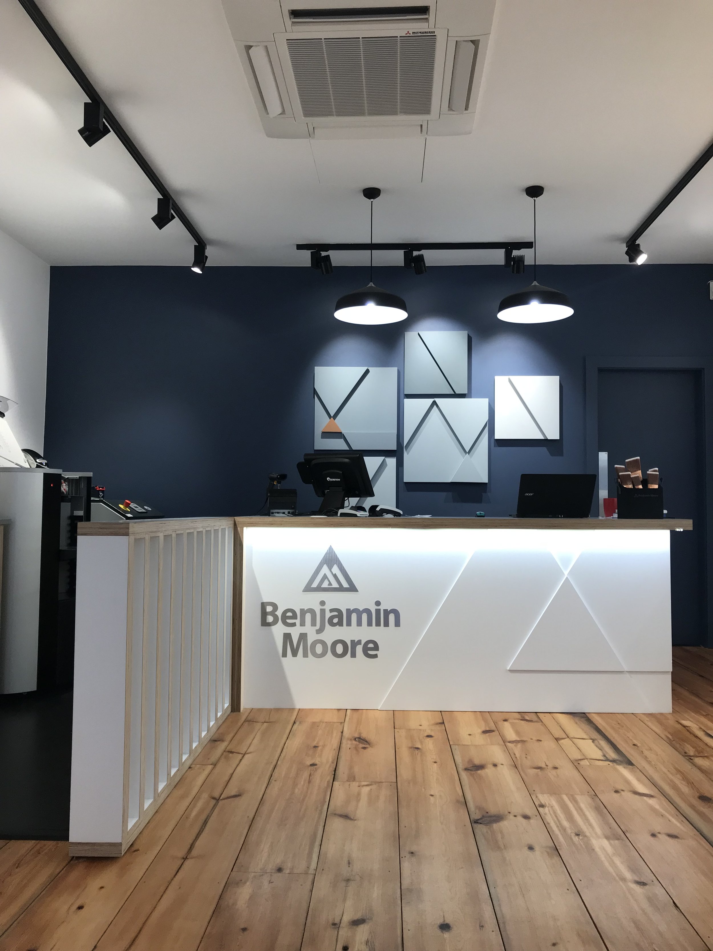
I attended a presentation at Benjamin Moores new Chelsea showroom last week. Honestly I came away with a head full of knowledge from a passionate team. If your not familiar with Benjamin Moore ...you need to be. OR you may have come across beautifully curated palettes on your Pinterest feed but never been able to sample and purchase. Well fear not people they have hit the UK and couldn't be more helpful. I really recommend a trip to the store to pick up some colour cards and see the finishes on offer. Slightly different in terminalogy then what we are used to in the UK market (but actually makes more sense!). Go with a colour palette in mind because the choice is vast and you can really hone into a palette and finish you require.
These are my six takeaways from the day and the reason why its worth trying this new brand.
1. Benjamin Moore is the established brand of choice in the US and available in all independents and big hardware stores (think Dulux of the US).
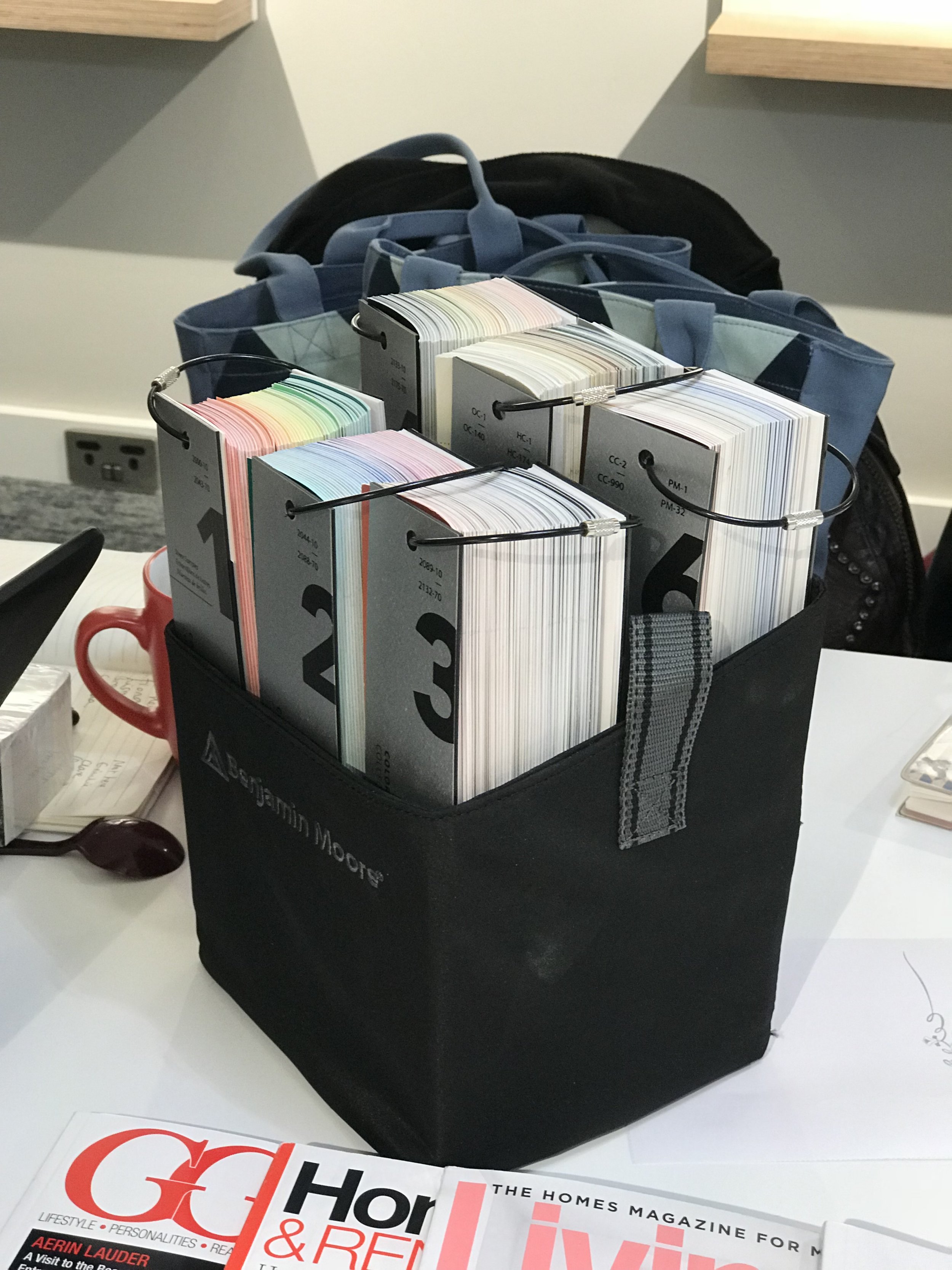
2. They have the choice of thousands of colours. However in the London showroom there is a focus on six ranges. For ease of use (although the ranges are still vast).
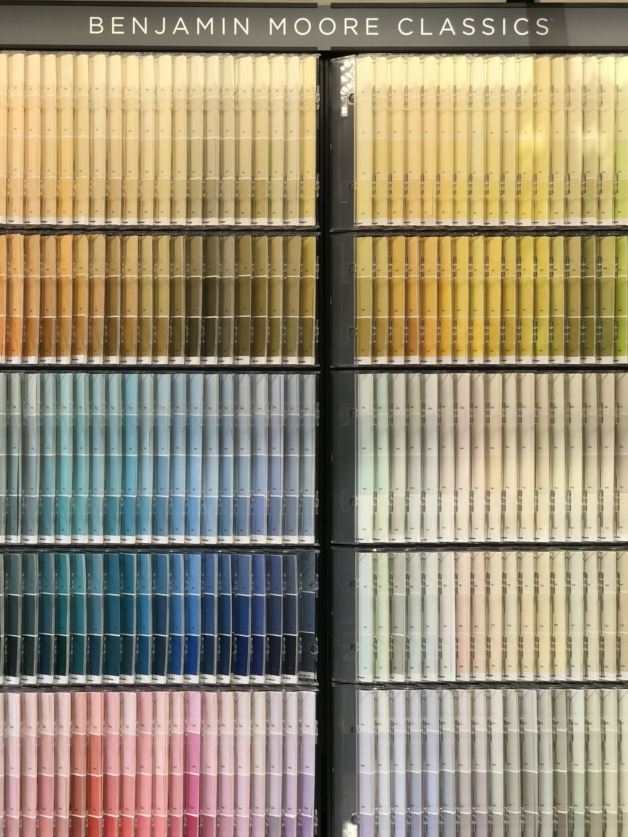
CLASSIC COLOUR RANGE. Designed by eye. Most useable /workable. Not a consistant level of saturation as the range is designed in the purest form from an experts eye. There is approxminatley seven shades of the same colour of one of the current middle class market leaders (ill let you guess who it might be!). This is the only range to look at for a variety of shades with lots of choice for muted schemes. I noted a great selection of greys that are particularly great for our UK light (or lack of it!).
COLOUR PREVIEW. The next stage up were the vibrancy is turned up a gear. For the those more confident with colour. More intense level of colour and ALOT to choose from.
COLLECTIONs
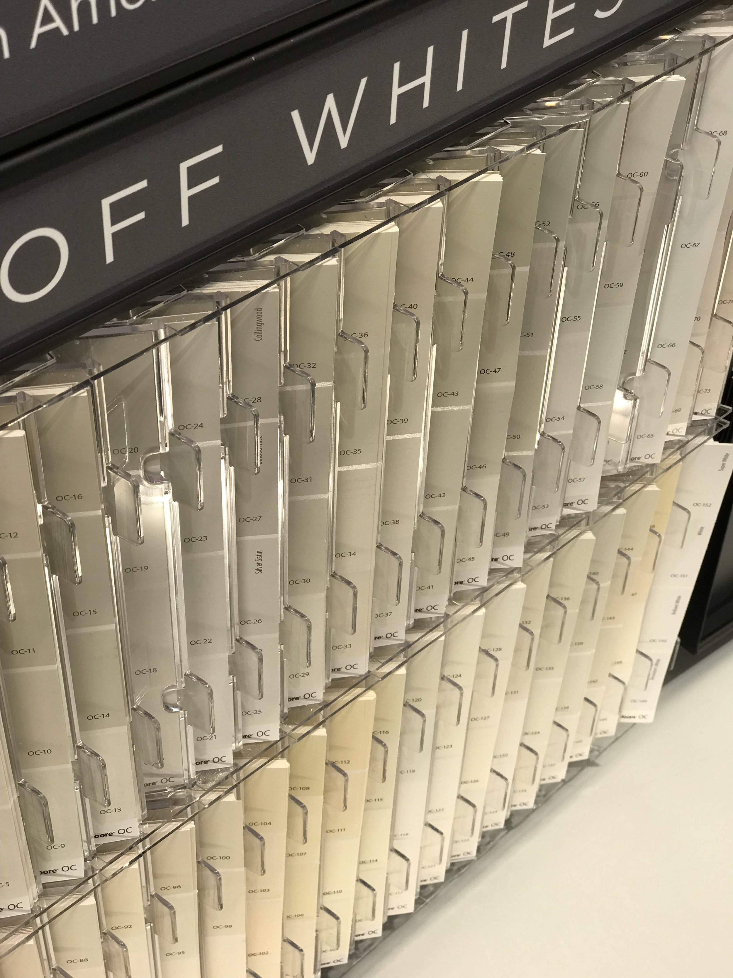
OFF WHITES
A selection from both ranges of considered pales. Particularly handy if you know your style and want a semi neutral palette.
HISTORICAL
Unique range of 18-19th century homes Heritage Palette. Perfect for the period homes in the UK
AFFINITY Is a one stop shop of 144 Colours for the complete novice. If you break out in a cold sweat at the thought of selecting a palette for your scheme. Head straight to this palette. Each colour is selected to go together and form a cohesive range. The colours have a chalky finish which has been popular in recent years.
COLOUR STORIES
Colour stories - Is the top end of the paint range, more experimental and never mixed with black or grey. Light plays an important part and responds better because of the use of pure colour. Yellow/blue/red. So the pigment percentage is high in this range. there fore slightly more expensive. This range is only for interior walls and woodwork not for external painting. Restrictions - not the same nuances, 240 Colours not the same colour choice as the Classics Range and can only be used for internal projects.
3. Everything is water based including the pigments. Therefore this range is naturally more environmentally friendly with all products having minimal VOC and zero emissions. Nautura is also a specialist product with the highest of eco credentials but also great for use in nurseries, or asthma sufferers.
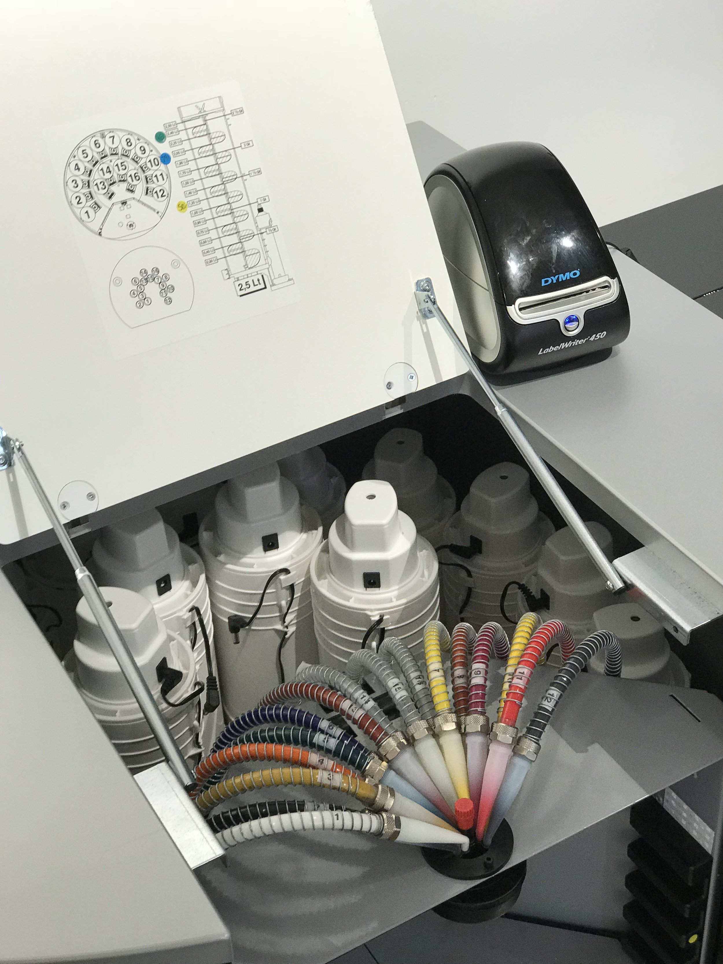
4. Sampling & Ordering. Testers 500ml - £6.50 - yes this needs a section all of its own. As all tester pots are especially mixed 500ml which is music to an interior designers ears! A lot cheaper then making a mistake 5 litre into the project and several man hours wasted. All goods are mixed and dispatched from Hayes on next day delivery or can be mixed in the Chelsea showroom.
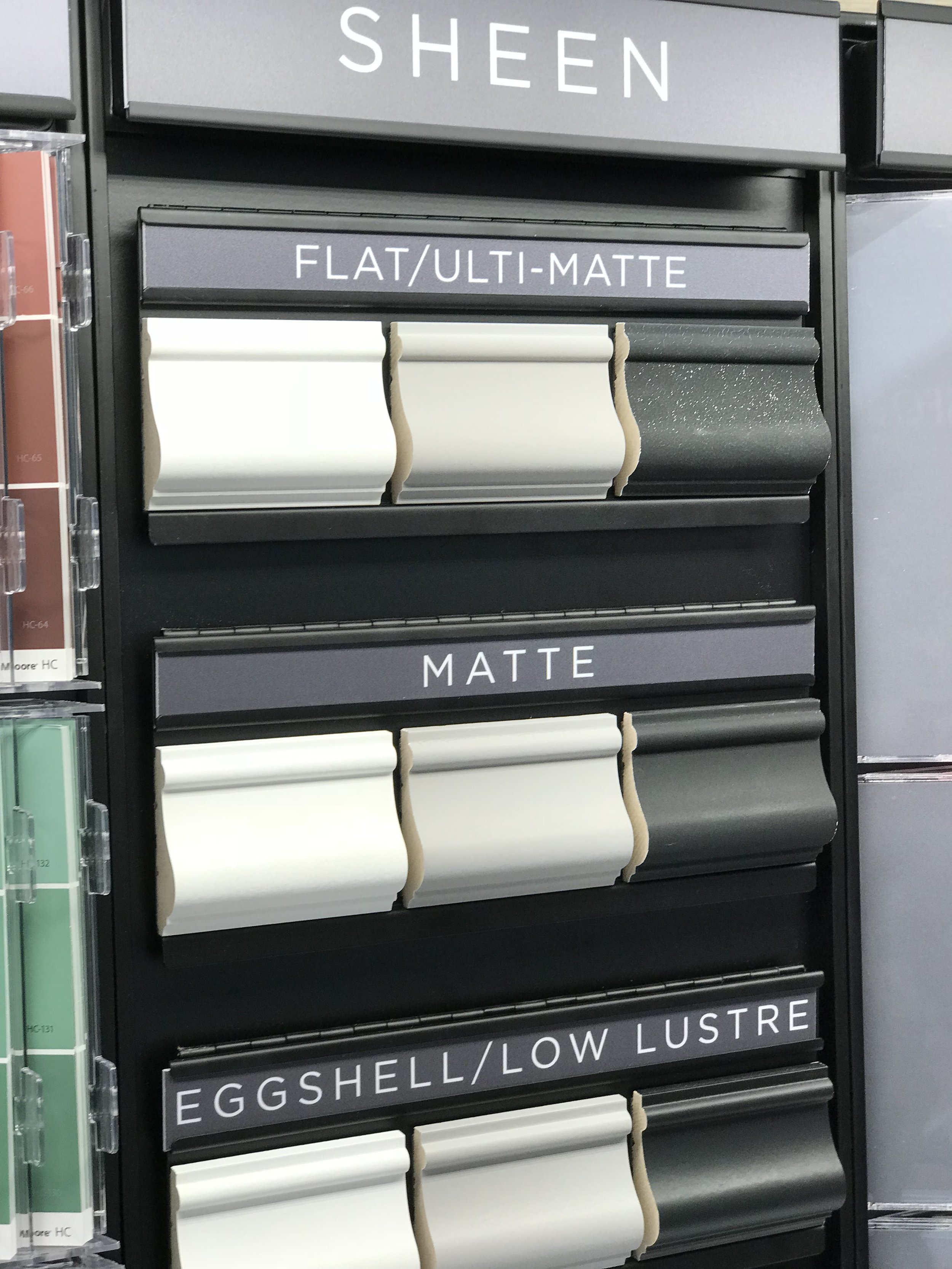
5. Range & quality of paint finishes. This is really were for me the advantage of using Benjamin Moore paints. Which is why I recommend a visit. Most finished are also self priming..saving time and money. The finished have completely slightly different terminology the the usual UK ref (satin wood, emulsion). If you doubt on ordering blind I would opt for Regal eggshell for walls and woodwork. A flat modern finish thats matt but not too chalky. However this is the level of sheen you can expect from their four options.
FLAT - CHALKY F&B FINISH - Good for Dark Ceilings - 2% sheen estate emulsion like
MATT - 3-5% Sheen - * recommended
EGGSHELL - 12-15% - Flatter then little green - *recommended (Regal option most popular range). For high traffic areas you may want to consider Eggshell Pearl more durable.
SEMI GLOSS - LOOKS LIKE SATIN WOOD
SATIN - LIKE A UK MARKET LEADER EGGSHELL*
ADVANCED FOR BOOK CASES AND KITCHEN CUPBOARDS.
6. Planning & Scheming - The team are on hand to offer recommendations and opinions on colour palettes and finish. A service that really doesn't exist on the market leaders on the UK high streets. Make the most of it!